A work in progress…


Inspired by wayfinding iconography… Especially from Amsterdam’s Schiphol Airport where I took these pictures:
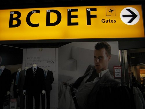
Lusting after the man modeling the Hugo Boss suit? No, this wayfinding sign was the main object of my infatuation.
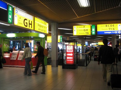
I took a picture because of the encased McDonald’s sign here… Mmmmm… French fries…
So, what am I up to now? Well, let’s see if this project is ever realized…


Jane
Monday, December 29, 2008 at 11:36 pm
Cute related video at http://funwithstuff.com/dswmedia/airport.html
Mark Denton
Tuesday, December 30, 2008 at 9:04 am
I wish you had a closeup up of the McDonald’s sign in the glass display case. That must be one nice sign. ;-)
Jane
Thursday, January 15, 2009 at 11:33 pm
I actually took several pictures at Schiphol Airport, including a close-up of that McDonald’s sign, but most of the pics didn’t turn out very well… Love your signs in the Texas Medical Center, by the way. I used to work there. Nice clean lines. Elegant. Modern. That medical center can be a maze to get around, especially for new patients who may even be unfamiliar with the city, so it’s nice having signs that are easy to read and understand at a quick glance. And now I know who’s responsible for designing them!
As for the TMC’s neighbor, Rice University… Wish some of that style would rub off on the signs marking Rice campus entrances… They are eyesores for this Rice alum and I cringe every time I see them…